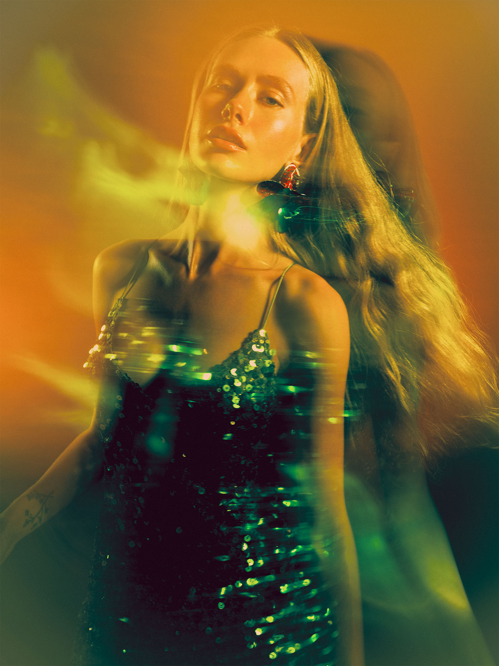
An editorial portrait becomes specific when every visible decision changes the way the subject is understood. Light, wardrobe, hair, makeup, color and framing are not independent layers added one after another. They form one system.
A reflective garment can turn a soft source into a field of highlights. A dark collar can change the apparent length of the neck. Hair can absorb the edge light intended to separate a silhouette. Colored light can make a carefully chosen skin tone, textile or makeup pigment behave differently from the way it appeared in preparation.
For a creative portrait session in Barcelona, the useful question is therefore not whether the styling or lighting should be more dramatic. It is what the portrait needs to communicate, and how every production choice can support that intention without competing for attention.
1. Define what the portrait needs to carry
Before deciding on a light or a look, define the role of the image.
An artist portrait for a release may need immediate recognition and enough graphic clarity for several formats. A magazine portrait may need to hold a longer sequence. A founder portrait can remain authored while still communicating confidence and professional context. A private commission may prioritize emotional presence over public utility.
Clarify:
- who will see the portrait;
- where it will appear;
- whether it must introduce, document or reposition the subject;
- what emotional distance feels appropriate;
- whether clothing should identify a role, create a world or remain quiet;
- how many images and orientations are required;
- whether the final edit needs variation or one concentrated statement.
Try to describe the portrait without naming a technique. “Controlled but vulnerable” is more useful than “red light with a hard shadow.” The first phrase can guide expression, posture, wardrobe, crop and light. The second describes an effect before its purpose is known.
2. Begin styling with silhouette and proportion
Styling first changes the body as a shape.
Shoulders, collars, sleeves, volume, waist position and footwear affect posture and the geometry of the frame. A sculptural upper silhouette may need a camera position and light that preserve its edges. A soft layered look may work through movement and overlapping tones rather than hard separation.
Before the shoot, evaluate each look from the intended camera distance:
- Does the neckline support the face or compete with it?
- Does the garment create a clear relationship between head, shoulders and torso?
- Will the silhouette remain readable against the planned background?
- Does the styling allow the movement the portrait requires?
- Are accessories creating useful direction or unnecessary points of attention?
- Does the strongest detail survive in both full and close crops?
The photograph does not record styling in the abstract. It records styling after perspective, pose, crop and light have changed it. Fittings and quick camera tests are valuable because a look that feels balanced in person may become visually heavy, flat or fragmented inside the frame.
3. Read materials by the way they return light
Every material has a lighting behavior.
Matte black cloth absorbs light and can lose construction. Satin turns the source into gradients and highlights. Sequins and metallic surfaces create many small reflections. Translucent fabric depends on what sits behind it. White material can shift toward the color of the environment. Skin responds differently again because its form, texture and specular highlights need to remain believable.
Instead of lighting the person and hoping the wardrobe follows, identify the material priorities in advance:
- which surfaces need texture;
- which edges need separation;
- where highlights may become distracting;
- whether transparency needs front, side or back light;
- how much contrast the darkest garments can hold;
- whether jewelry or reflective makeup creates uncontrolled points of brightness.
In Un-frosted, translucent styling, cool color and beauty treatment belong to the same temperature and surface logic. The material does not simply sit inside blue light. Its transparency and structure help the light become visible.
A lighting test should include the actual hero material whenever possible. Testing only on neutral clothing can hide the problem that will consume time once the final wardrobe enters the set.
4. Treat color as a relationship
Color in an editorial portrait comes from several places at once: skin, wardrobe, makeup, hair, background, practical sources and the spectrum of the photographic light.
The goal is not necessarily color accuracy in a catalogue sense. The goal is controlled relationships. A portrait can be strongly transformed while still preserving intentional skin, garment hierarchy and emotional tone.
Build a simple palette structure:
- dominant color that establishes the world;
- supporting color that connects subject and environment;
- accent color used sparingly for direction;
- neutral or dark areas that give the palette somewhere to rest;
- colors that should be avoided because they weaken the intended relationship.
Echo of Light uses reflected and layered color as part of the subject’s presence. The result depends on balance: if every surface carried equal saturation, the face would lose authority. If styling ignored the palette, the colored light would feel applied rather than integrated.
Colored light also changes makeup and textiles in ways that are difficult to predict from a phone reference or fitting-room mirror. A pigment can become dull, fluorescent or visually merge with the background. Short tests with the real camera profile and intended exposure are more reliable than assumptions based on how colors look to the eye.
5. Shape the face without erasing the person
Portrait light organizes attention across the face.
Source size, height, angle, distance and fill affect bone structure, eye visibility, skin texture and the apparent emotional distance between subject and viewer. A large frontal source can create openness and graphic clarity. Side light can reveal volume or withhold information. Hard light can introduce precision and tension. Deep shadow can make a portrait quieter, more private or more confrontational depending on expression and framing.
The purpose is not to apply one flattering formula. It is to decide what kind of presence the portrait needs.
Observe:
- whether both eyes need to remain available to the viewer;
- how the shadow changes expression;
- whether the forehead, cheek or jaw receives too much emphasis;
- how the light responds when the subject moves rather than holding one mark;
- whether glasses, jewelry or glossy beauty details introduce unwanted reflections;
- how close crops change the tolerance for contrast and texture.
In Shadows of Her, shadow is not missing information that needs to be recovered. It is the structure that creates the emotional distance of the portrait. Styling remains restrained enough to support that structure rather than asking for a second, unrelated reading.
6. Design beauty for the final light
Hair and makeup should be planned for the source, contrast and camera distance that will actually be used.
Makeup seen in soft daylight behaves differently under a small hard source or saturated gel. Matte and gloss create different highlight patterns. Fine texture may disappear in a wide frame but become central in a beauty crop. Hair can provide silhouette, movement and shadow, but it can also block the face or absorb separation from a dark background.
The beauty plan should answer:
- Is skin meant to feel natural, polished, luminous or materially transformed?
- Which areas may carry controlled shine?
- Does eye detail need to survive shadow or colored light?
- Is hair part of the face framing, the silhouette or both?
- Will the look remain coherent across required crops?
- What needs checking after each lighting change?
Winter Waves demonstrates how sculptural hair, skin and garment texture can share the frame without becoming three competing demonstrations. Their hierarchy is established through light and crop.
Beauty references should be reviewed together with lighting references. Approving them separately postpones the most important decision: how they will interact in the final image.
7. Test the complete relationship, not isolated departments
A useful test puts the critical elements in the same frame.
For a technically simple portrait, this may happen during the first setup. For reflective wardrobe, complex beauty, projection, colored light or a tight production schedule, a short prelight or camera test can protect the full shoot day.
Test:
- hero garment or a material with similar behavior;
- intended makeup finish and important pigments;
- hair silhouette;
- background tone or location surface;
- approximate camera distance and crop;
- movement range;
- exposure and color approach;
- one likely final export size.
The aim is not to finish the photograph before the subject arrives. It is to discover conflicts early. A test should reveal whether the concept can remain flexible on set rather than forcing the team to solve basic compatibility under time pressure.
The broader studio versus location guide explains how environment changes these variables. Available light and constructed studio light can both support editorial portraiture, but they offer different levels of repeatability and control.
8. Direct the person inside the visual system
Once the technical world is ready, it must remain responsive to the person.
Heavy styling can restrict movement. A narrow light can require precise marks. A close beauty crop can make small changes in breath, jaw and gaze significant. Direction should acknowledge those conditions without reducing the subject to a display surface.
Begin with the simplest version of the setup. Establish posture, face and communication before increasing complexity. Give direction in terms of action and attention rather than asking only for shapes. Then allow the light and styling to respond as the subject finds a credible way to inhabit the image.
During the session, watch for moments when the production starts to dominate. If viewers will remember only the lighting technique or accessory, decide whether that is the intended hierarchy. An authored portrait can be visually constructed and still leave the person as its central event.
9. Build variation without changing the language
An editorial portrait assignment often needs more than one successful frame.
Variation can come from:
- camera distance and orientation;
- direct versus withheld gaze;
- stillness versus controlled movement;
- a change in garment layer or accessory;
- harder or softer contrast within the same lighting logic;
- shifts between face, half-length, full-length and detail;
- negative space for text or design use.
The sequence should change information without abandoning its visual vocabulary. Producing several unrelated lighting schemes can create apparent variety while weakening the final edit.
The campaign framework in Art direction for an independent fashion campaign applies here at a smaller scale: define the vocabulary, required channels and image roles before collecting options.
10. Edit and retouch the system as a whole
The final relationship between light and styling is completed in the edit.
Select images not only for expression but for the way garment, face, color and crop work together. A technically perfect frame may be weaker if styling has collapsed, an accessory interrupts the gesture or the light no longer supports the intended emotional register.
Retouching should preserve hierarchy. It can align skin, remove temporary distractions, control material highlights and maintain color continuity, but it should not replace unresolved direction with a new visual language.
Review the final group at delivery size. Fine beauty work, dark garment detail and subtle color separation can behave differently after resizing and compression. Confirm that each required crop still protects the face, silhouette and essential styling information.
Common light and styling conflicts
Several problems recur in editorial portrait production:
- wardrobe is selected without considering background separation;
- a reflective hero piece is introduced after lighting has been approved;
- colored light destroys the intended makeup or garment relationship;
- hair blocks the face or edge light in key angles;
- accessories create highlights stronger than the eyes;
- every element is treated as a focal point;
- the subject cannot move inside the styling or lighting marks;
- multiple lighting ideas create a fragmented final sequence;
- retouching removes material texture that gave the styling its character;
- required crops are considered only after the shoot.
These conflicts are usually solved through hierarchy and testing, not by adding more equipment or more styling. Decide what the viewer should notice first, what supports that reading and what can be removed.
What to include in a portrait inquiry
To begin the visual direction efficiently, share:
- who the portrait is for and how the images will be used;
- the desired emotional register;
- required orientations, crops and final image count;
- wardrobe or styling already available;
- whether makeup, hair or styling support is needed;
- visual references and anything that should be avoided;
- studio or location preference, if one exists;
- production timing and delivery date;
- usage requirements and an indicative production range.
The brief does not need to prescribe the lighting. It should make the subject, purpose and practical conditions clear enough for light and styling to be designed as one portrait system.
To develop that system, use the creative portrait inquiry.