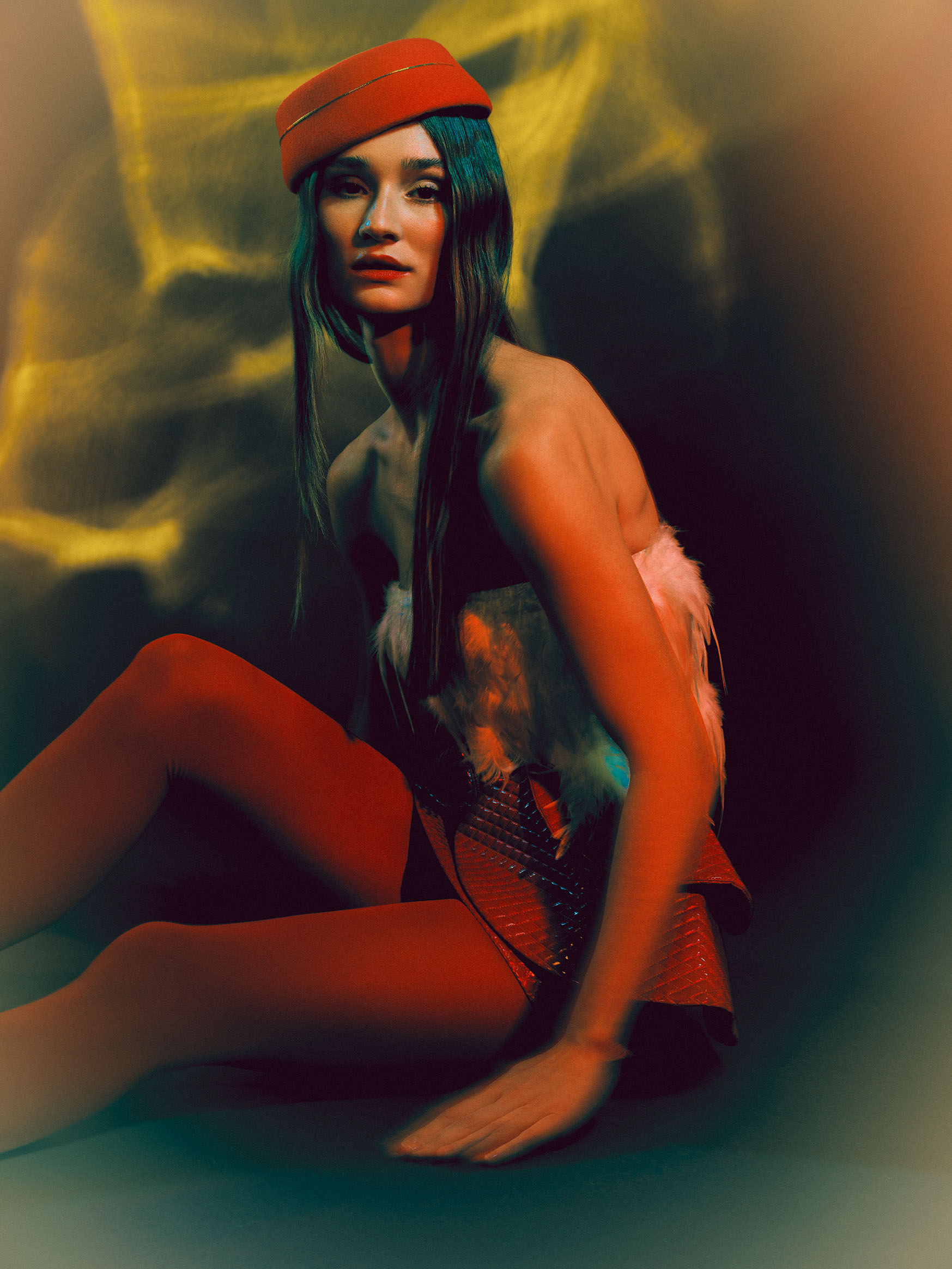
Independent fashion brands rarely need more visual noise. They need a campaign that makes the collection legible, gives the label a recognizable position and produces enough useful material for the places where the work will actually appear.
That is the role of art direction. It is not a moodboard added before the shoot and it is not a layer of decoration placed around the clothes. Art direction is the system connecting brand, collection, audience and image use. It determines why a person, gesture, light, color, location and frame belong together.
For a fashion photography campaign in Barcelona, that system also has to survive real production conditions: a finite budget, a small team, sample availability, changing weather, multiple formats and a delivery schedule. The strongest direction is not the one with the most elements. It is the one that makes each element do clear work.
1. Begin with the position, not the visual reference
Before collecting images, define what the campaign must change or clarify for the audience.
An emerging label may need to introduce its visual identity. An established independent brand may need to move into a new category without losing recognition. A capsule collection may need one concentrated statement, while a seasonal release may require a broader system that can hold several drops.
A useful opening brief answers:
- what the brand makes and why it exists;
- what is distinct about this collection;
- who needs to recognize themselves in the work;
- what perception should become stronger after the campaign;
- which pieces or categories carry commercial priority;
- where the images will appear;
- what production constraints are already known.
Try to complete one sentence: this campaign should make the collection feel… The answer should be specific enough to reject unsuitable decisions. “Premium” or “creative” is too broad. “Precise but physically alive” can guide casting, movement, framing, fabric treatment and light.
2. Read the collection as material
The collection should lead the image world. Look at silhouette, construction, surface, weight, repetition and the way garments change when the body moves.
Ask which qualities need to remain visible:
- tailoring and proportion;
- transparency or layering;
- reflective, matte or tactile surfaces;
- print and color relationships;
- volume in motion;
- details that distinguish the product;
- the contrast between different looks.
In Glittering Hibernation, reflective clothing, the beauty construction and atmospheric light are not separate effects. They reinforce the same cold, suspended image world. If the light flattened the garment or the makeup introduced an unrelated palette, the frame would lose its internal logic.
Art direction should protect product clarity without reducing every image to a catalogue view. Decide when the garment must be fully readable and when atmosphere, crop or movement can carry the campaign emotion. Both kinds of frame can coexist when their roles are planned.
3. Build a visual vocabulary, not a reference collage
A moodboard becomes useful when it is translated into a limited set of repeatable decisions.
Define the campaign vocabulary across:
- palette: dominant, supporting and prohibited colors;
- light: hard, diffused, available, constructed, colored or mixed;
- space: open, compressed, graphic, domestic, industrial or abstract;
- body language: direct, withheld, fluid, formal or confrontational;
- framing: full length, portrait, detail, negative space and camera distance;
- texture: polished, raw, soft, reflective, wet or granular;
- rhythm: quiet repetition, escalation, contrast or fragmentation.
The point is not to make every frame identical. The vocabulary creates a boundary within which variation still feels intentional. Chroma Drama uses a strong color relationship, graphic styling and direct portrait presence. Individual images can change pose and emphasis because the underlying language remains stable.
A concise direction document should explain each decision in words. References can show a feeling, but production requires instructions that a stylist, makeup artist, model, lighting team and retoucher can interpret consistently.
4. Design the campaign around its channels
The final image use changes the composition before the shoot begins.
A campaign may need:
- a primary landscape or portrait key visual;
- homepage and collection-page headers;
- vertical social and paid-media crops;
- press images with clear garment information;
- full-length looks for wholesale or line-sheet support;
- close details for materials and accessories;
- a sequence for launch posts or a digital editorial;
- negative space for typography;
- still and motion assets from the same production.
Create a deliverable matrix before making the shot list. It should connect each required asset with orientation, subject, look, channel, text-safe space and priority. This prevents a familiar problem: producing many strong portraits but discovering later that none can hold a website title or a horizontal campaign placement.
Commercial use also needs to be defined early. Organic brand channels, press, retail partners and paid advertising can involve different durations, territories and permissions. Casting agreements, production scope and pricing should reflect the intended use rather than being reconstructed after delivery.
5. Cast for the relationship between person and brand
Casting is an art-direction decision, not a final production task.
The model brings physical rhythm, expression, cultural associations and a way of carrying clothes. A campaign that depends on stillness needs someone who can hold subtle tension. A collection built around volume may require range and control in movement. A direct beauty image asks for a different kind of presence than an observed location story.
Evaluate casting through the complete direction:
- Does the person make the clothing feel credible?
- Can their movement reveal the construction?
- Does their presence support the brand position without becoming generic?
- Will face, hair and skin work with the planned palette and beauty treatment?
- Can the casting hold both key visuals and practical product frames?
For independent campaigns, one well-chosen model can provide coherence across a compact production. Multiple models can broaden the story, but they also increase styling changes, timing, usage agreements and the complexity of maintaining one visual language.
6. Align styling, beauty and light
Wardrobe styling should establish hierarchy rather than simply present every available look. Identify hero pieces, supporting garments, accessories and combinations that communicate the collection most clearly.
Beauty direction needs the same discipline. Hair and makeup may extend the silhouette, introduce texture, shape the face under a particular light or create a deliberate contrast with the clothes. Every addition should have a reason visible in the final frame.
Light then connects body, product and environment. It determines whether black materials separate, translucent layers remain visible, reflective surfaces become controlled highlights and color stays accurate enough for the intended use.
Un-frosted shows how a narrow visual vocabulary can hold styling, beauty and color together without competing signals. The image feels specific because the elements agree about temperature, surface and presence.
Testing these relationships before production is valuable when the collection includes difficult materials, strong makeup, projection, colored light or reflective accessories. A short technical test can prevent expensive uncertainty on the full shoot day.
7. Choose environment by narrative and production value
The location or studio should provide something the campaign cannot gain more efficiently elsewhere.
A studio offers control, privacy, repeatable light, efficient changes and the ability to construct an abstract world. A location can add architecture, social context, weather, scale and movement. A hybrid production can separate controlled product frames from a more atmospheric campaign sequence.
The longer studio vs location guide explains the practical differences. For art direction, the essential question is simpler: does the environment strengthen the brand idea, or is the campaign spending attention on a place that belongs to another story?
Barcelona provides many visual registers within a compact geography, but recognizable architecture should not be used only to prove that a production happened in Barcelona. Place should earn its role through the collection and the intended audience.
8. Turn the direction into a production document
Once the visual system is approved, it needs to become operational.
The working treatment should contain:
- campaign objective and one-sentence direction;
- collection priorities and confirmed looks;
- casting and team responsibilities;
- palette, light, beauty and environment notes;
- deliverable matrix and shot architecture;
- schedule with realistic change and setup time;
- location, permits, access and weather alternatives;
- equipment, set and technical requirements;
- usage, credits and delivery dates;
- decision owners and approval points.
For a compact independent team, clarity matters more than presentation volume. A concise treatment that resolves responsibilities is more useful than a long deck built from references nobody has translated into actions.
The production workflow in How an editorial fashion shoot is produced in Barcelona can be adapted to campaigns, with additional attention to product priority, brand channels and commercial usage.
9. Direct a sequence, not isolated successful frames
During the shoot, the art direction must remain visible while the team responds to what is actually happening.
Review progress against the complete asset plan. Confirm that hero looks have both expressive and readable frames, essential orientations are covered, details exist where needed and the sequence has variation in distance and energy.
Silent Flames demonstrates how silhouette, material and movement can carry images across a sequence. A full-length frame has a different function from a close portrait, but both can belong to the same world.
The shot list should protect essential coverage without turning the day into mechanical completion. Leave enough time inside the strongest setups for the model, clothing and light to produce something not fully visible in the treatment. Art direction creates coherence; direction on set keeps that coherence alive rather than rigid.
10. Edit for recognition and usefulness
The campaign edit is where the visual system becomes visible as a whole.
Select first for function, then for rhythm. The strongest individual frame is not always the right frame for the final sequence if it repeats another image, breaks product hierarchy or introduces an unrelated emotional register.
A complete edit should balance:
- immediate campaign recognition;
- accurate and persuasive clothing information;
- variation in scale, orientation and movement;
- continuity of palette and retouching;
- practical channel requirements;
- enough restraint that the brand remains more memorable than the production technique.
Retouching should preserve the decisions made in camera while aligning color, skin, fabric and background across the set. Final crops and exports should be made from the approved master selection rather than allowing each channel to reinterpret the campaign independently.
Common art-direction failures
Several problems appear repeatedly in small campaign productions:
- references are visually attractive but unrelated to the collection;
- too many ideas compete inside one production day;
- casting is confirmed before the required presence is defined;
- styling prioritizes quantity over hero-product clarity;
- the location overwhelms the brand;
- all images use the same distance and energy;
- vertical social assets are produced without horizontal or text-safe options;
- usage and approvals remain undefined until after the shoot;
- retouching introduces a different visual language from production.
Most of these are not budget problems. They are unresolved decision problems. A smaller campaign with one clear idea, one precise cast and a disciplined asset plan can establish a stronger identity than a larger production with no hierarchy.
What to include in the first campaign inquiry
To begin efficiently, share:
- the brand and collection context;
- launch date and production window;
- intended audience and territories;
- confirmed sales, press, organic and paid channels;
- hero products and approximate number of looks;
- existing brand guidelines or campaign references;
- team members already attached;
- preferred studio or location direction, if known;
- required still and motion deliverables;
- usage duration and an indicative production range.
The brief does not need to arrive with a finished concept. It needs to make the real objective and constraints visible. From there, the art direction can be built around the collection instead of being imposed on it.
To develop the image system and production approach, use the fashion and campaign inquiry.